
As an adventure creator over the last six years, it’s time for me to kind of clean up my act.
And what does that mean?
Well, it really means improving my process, putting together a really good style guide, and thinking more seriously about typography.
I started creating adventures for Dungeons & Dragons back in 2020. My method then was pretty simple: write everything in Microsoft Word, send it over to the editor for him to clean up, get it back, move things around on the page, insert some pictures here and there, and then convert the whole thing to a PDF.
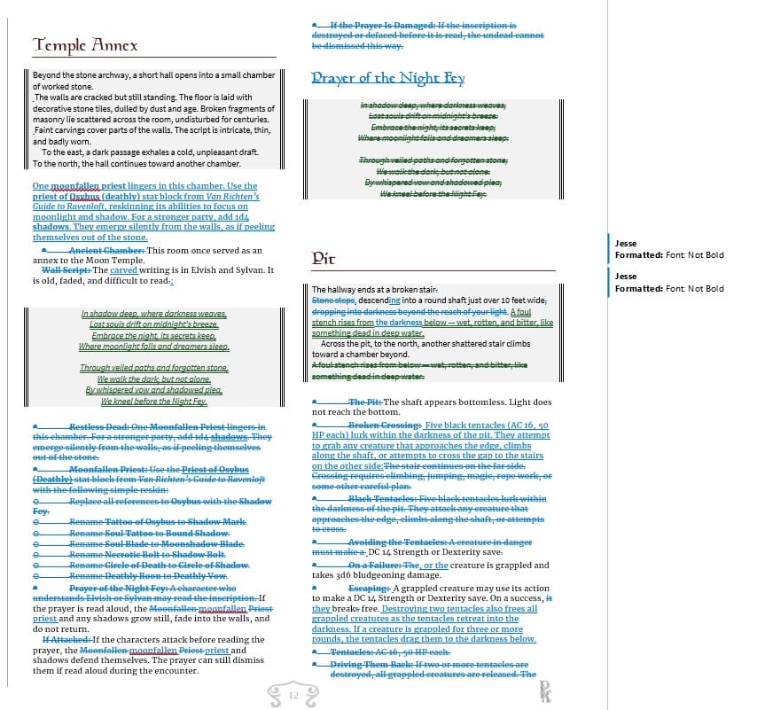
It’s a pretty archaic method of doing things, but I’ve been using Word for, well, let’s just say a few decades. So the process was really born out of legacy rather than productivity. It’s something I am comfortable with, but I also really, really hate so many things about it.
Frankly, it’s just an archaic system.
So over the last couple of months, I have been spending a lot of time thinking about how I can increase my productivity and make everything look better.
The first thing I thought was the problem and I was sorely mistaken, was layout.
I assumed my PDFs just didn’t look good enough in their final form, so maybe what I needed to do was learn Affinity Publisher or Adobe InDesign. I spent months playing around with both of them, working through their graphical interfaces, watching instructional videos, and trying to figure everything out.
And the whole time, I kept thinking to myself: There has got to be a better way to do this.
Honestly, Adobe InDesign and Affinity Publisher started to feel just as archaic to me as using Word as a word processor.
Eventually, I got fed up enough that I hired four different people as a test to do layout for me. Each one took a shot at it, and you know what? I didn’t like a single one of them.
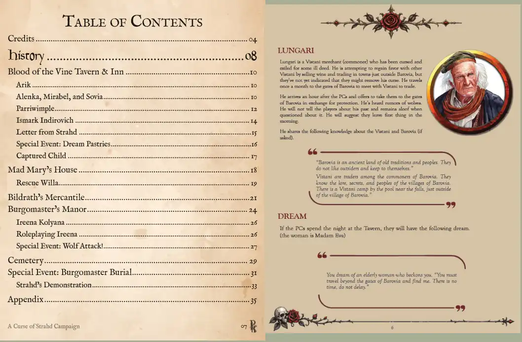
So I started trying to figure out what the actual problem was. Was it my content? Was it the people I hired? Did they know how to use Adobe InDesign but not actually know what the fuck they were doing?
Because, frankly, some of it looked like shit.
I was racking my brain trying to find a better way, so I finally did what I probably should have done in the beginning: I reached out to my trusted, tried-and-true editor, Jesse Winter.
Style Guides and Tough Love
The first thing you need to know about a good editor is that a good editor is like having a good friend who has absolutely no problem giving you some tough love.
Jesse is like that wingman who goes to the bar with you and knows when you’re starting to put on the beer goggles. He knows you might have a fun time tonight, but you’re probably going to regret it in the morning, and he’s going to do his best to keep those beer goggles off.
That’s the kind of editor you want—someone who has no problem metaphorically slapping you in the face, sitting you down, and saying, “You just don’t get it.”
And that’s what Jesse did for me.
I reached out to him and explained my frustration. He said there were really two things I needed to address.
The first was the style guide.
So what exactly is a style guide?
One of the most familiar examples is The Chicago Manual of Style. At its most basic, a style guide is simply a set of rules for how you’re going to produce and present a document. How do you indent something? When do you use bold? How do you handle headings, capitalization, punctuation, and all those little decisions that otherwise get made differently every time?
It gives you consistency.
In the TTRPG space, though, a style guide can go a step further. It can establish how you actually present an adventure: how you organize a scene, how you present information to the GM, how you handle read-aloud text, NPCs, encounters, locations, and so on.
Dungeons & Dragons has its own style guide, which you can download from DMs Guild. I’ll put a link below if you want to take a look at it.
I had been using a rough style guide for D&D, but it was loose and inconsistent. They weren’t really hard-and-fast rules.
So I asked Jesse for some ideas.
He suggested that before we created anything, we should look at adventures from different publishers and figure out what I actually liked. From there, we could take those ideas, weave them together, and develop a style guide that worked specifically for me.
He spent some time sending me screenshots and examples from different adventures, different ways people presented locations, encounters, NPCs, read-aloud text, and information on the page.
I told him I wanted something elegant and succinct. Something OSR/NSR friendly.
I didn’t want it to be verbose, and between you, me, and the fence post, verbosity is probably my hidden demon. Whenever it starts creeping back in, I need to revisit Hemingway’s Iceberg Theory to put the demon back in the box. Fortunately, I also have Jesse around to bring me back down to earth.
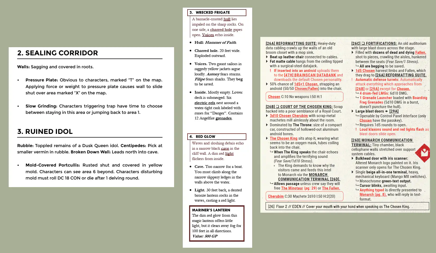
Eventually, after looking through all these examples, we began outlining what my own style guide should look like. Jesse spent a few days putting it together and sent me a Word document outlining the rules I should follow when thinking about how I present information in an adventure.
Now I had some structure, but that was only half of the equation.
The second half was typography.
Typography
If you don’t know much about typography and I really didn’t, there is a fantastic website called Practical Typography. It gives you a very good introduction to what typography actually is and why it matters.
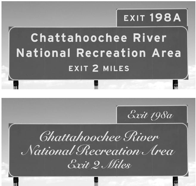
Typography is really a science. There are established rules and conventions that have developed across the publishing industry: font choice, font size, line spacing, line length, margins, hierarchy, how much space goes between elements, and how all of those things work together on the page.
But there’s also an art to it.
It’s understanding which fonts work together, how much breathing room the text needs, how the eye moves across the page, and how all of those little decisions affect whether something feels elegant and easy to read or like an absolute mess.
That was the second piece I had been missing.
A style guide and good typography really work hand in glove.
- The style guide determines how you present the information.
- Typography determines how that information is experienced on the page.
Put the two together, and now you have the foundation for producing a really good, clean document or, in my case, a really good, clean adventure.
Layout
I had previously put the cart in front of the horse. I was worrying about layout before I had actually figured out my style guide or typography.
Now that I had both of those things handled, it was finally time to go back to layout and this is where I started getting frustrated again.
Do I go back to Affinity Publisher? Do I try Adobe InDesign again?
I had struggled with both of them. They’re graphical interfaces where you’re moving things around visually on the page, and that whole process just wasn’t clicking with me.
Look, people can and do create some amazing adventures with InDesign and Affinity, but you either need to become very good at using them and find the time to do it, or find a rock star who can do it for you.
And that rock star better understand both your style guide and typography.
I learned the hard way that knowing how to use Adobe or Affinity does not necessarily mean someone understands typography. I spent a pretty penny on four different people learning that lesson, and I really didn’t want to spend more time, more money, or become reliant on someone else for layout.
So I was sharing all of this frustration with a friend of mine who has absolutely no interest in role-playing games but does write professional papers.
She asked me, “Have you ever heard of Typst?”
I said, “I have no idea what you’re talking about.”
She explained that people in academic research, science, medicine, and the legal field use systems like Typst for producing papers, documentation, books, and PDFs. Instead of dragging things around on a screen, you write your document using a markup language and let the system handle the layout.
Now, when she said the word markup, my ears immediately pricked up because I am obsessed with Obsidian. I use Obsidian constantly on both my phone and laptop, and I basically treat it as my second-brain depository. I also use LegendKeeper all the time, which works heavily with Markdown and is fantastic for designing and organizing adventures. I’ve already put Legends of Saltmarsh online that way.
So when she explained that I could write my document in a markup language and not spend my time dragging boxes around inside a graphical interface just to produce a PDF, I thought: Great. Now you have my attention.
At this point, I already had the style guide Jesse had created for me, and I had been learning the basics of typography.
So I dove into Typst.
I figured, look, I know some basic coding. I build Foundry adventures. I already work in Markdown through Obsidian and LegendKeeper. This should be a breeze.
And, surprisingly, it pretty much was.
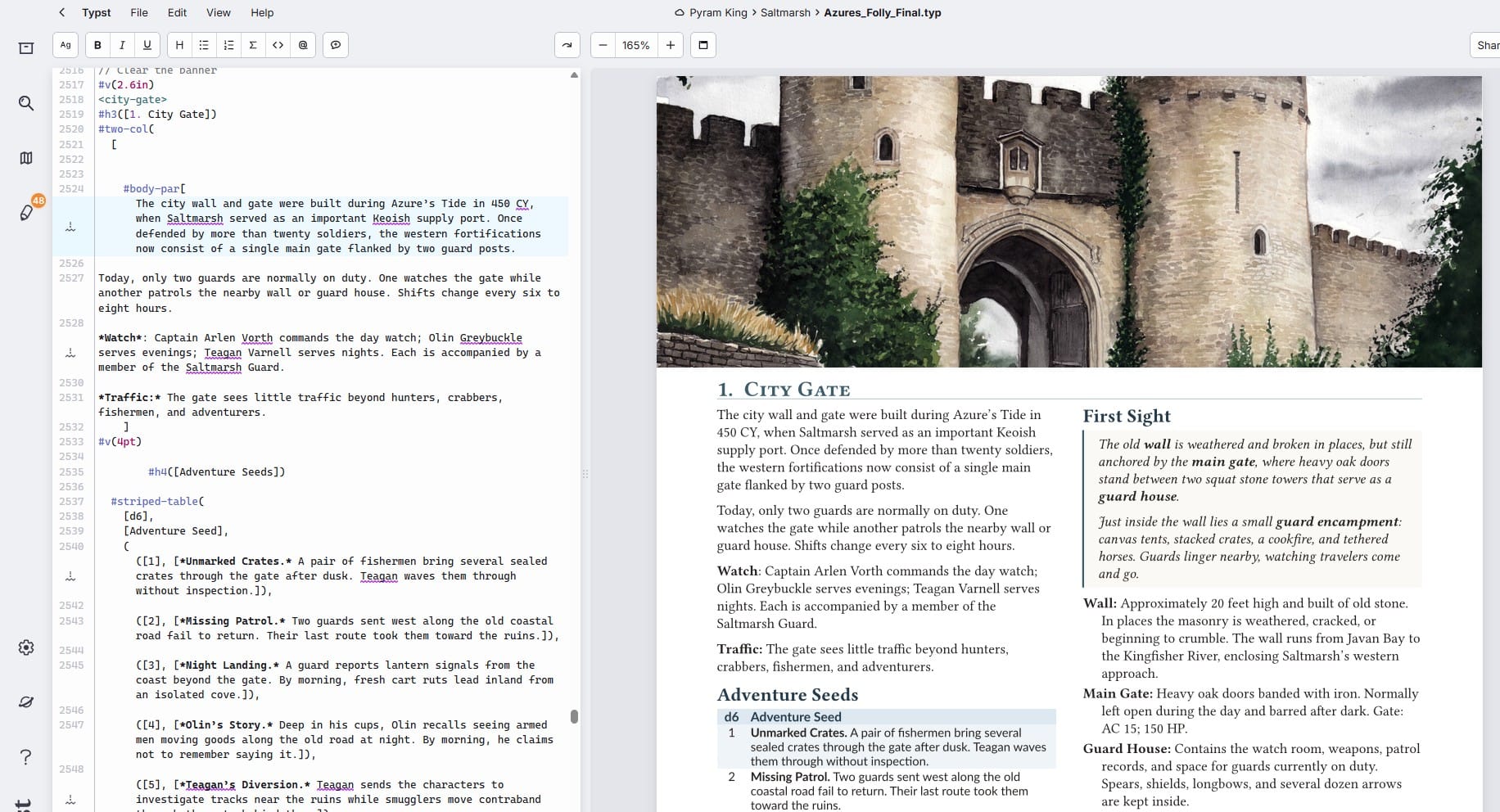
Within about a week, I had figured out enough Typst to start building templates, structuring documents, handling spacing and layout, and creating a repeatable system for producing my adventures.
More importantly, it made the entire process easier.
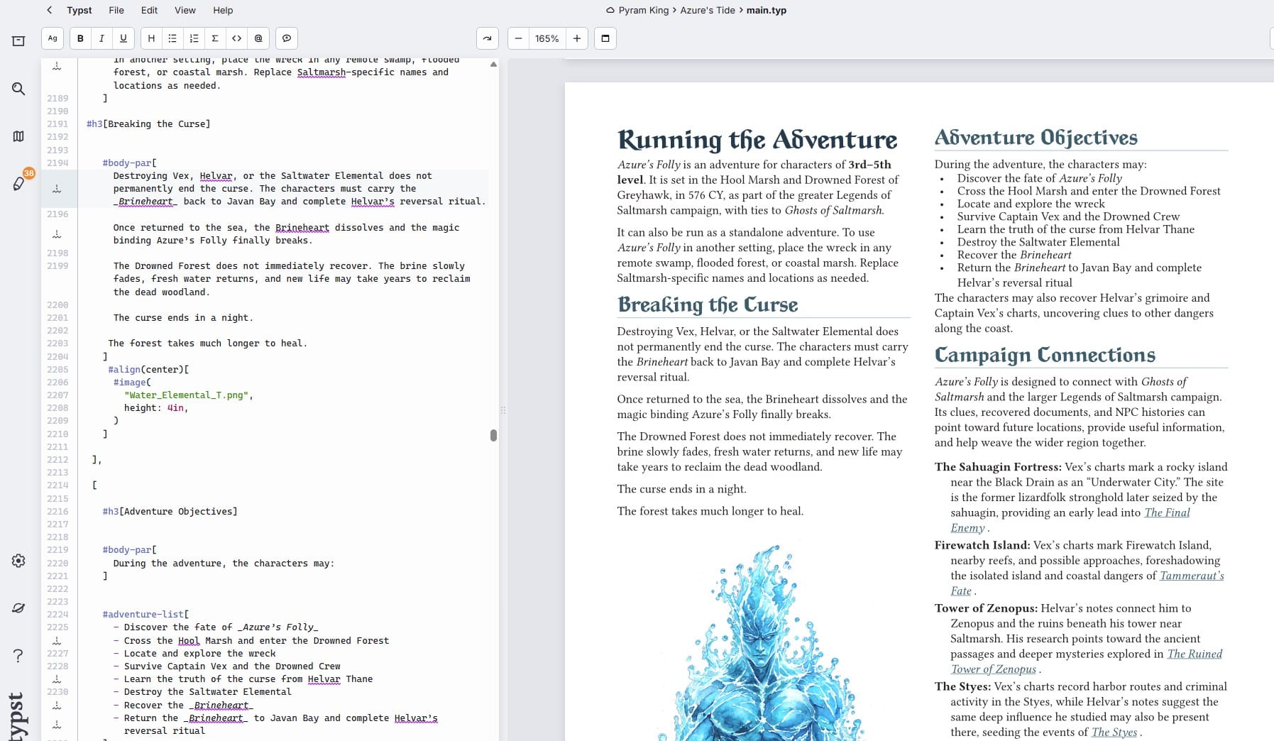
Now, when I sent the final document to Jesse for review, he wasn’t looking at a half-finished Word document that would later get thrown into another program for layout. He could review the actual finished document, check the typography, make sure I was following the style guide, and see exactly how everything worked together on the page.
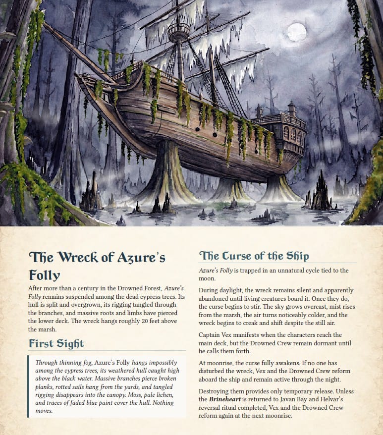
So I produced my first adventure using this new process: Jesse’s style guide, the typography principles I had been learning, and Typst handling the layout.
And I was really, really excited about the results.
It was clean, efficient, and maybe most importantly, I had finally found a productivity tool that worked the way my brain works.
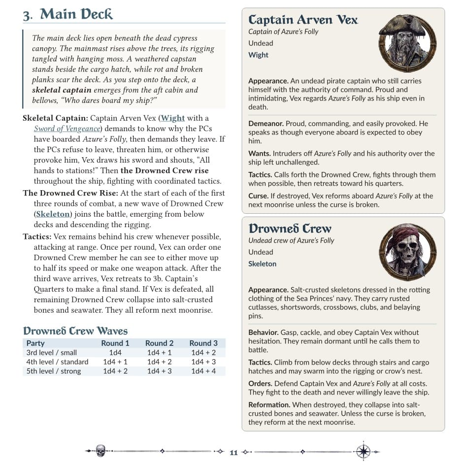
Instead of fighting with layout software, I now had a system where I could concentrate on writing the adventure, follow a consistent set of rules, and produce a finished document quickly and easily.
After six years of doing this, I finally feel like I’m getting the cart behind the horse.
Some Resources
For those interested in learning more about all of this, or in designing and publishing your own adventures, here’s a quick summary of the people, tools, and resources I would recommend checking out.
Get an Editor!
First and foremost, if you’re serious about producing quality PDFs, print-on-demand products, or even offset-printed books, find yourself a good editor.
For me, that’s Jesse Winter of Duo Storytelling.
Jesse is top notch. He has edited multiple games you can find on DriveThruRPG, worked on successful Kickstarters, edited fiction, and worked extensively with tabletop role-playing games. He’s familiar with Dungeons & Dragons, Shadowdark, different publishing standards, and the various style guides used throughout the industry.
But more importantly, he’s also going to kick your ass when you need it, and I mean that as a compliment.
A good editor isn’t someone who just fixes your commas and tells you everything looks great. You want someone who will challenge you, point out where something isn’t working, and tell you when you need to go back and fix it.
You want that critical friend.
If you’re looking for someone like that, check out Jesse Winter and Dual Storytelling. They also have a section specifically focused on adventure and TTRPG design, which is well worth taking a look at.
Learn About Typography and Style Guides
The next resource I highly recommend is Practical Typography.
This website has a tremendous amount of useful information and will give you a solid foundation for understanding typography and why it matters. It covers things like font choice, spacing, line length, hierarchy, page design, and all those little details you may never have thought about, but that make an enormous difference when somebody actually sits down and reads your document.
There are also some excellent fonts available through the site if you’re looking to invest in something for your own publishing.
Definitely check it out.
would also recommend looking at existing style guides. For example, Dungeons & Dragons has its own style guide available through DMs Guild. If you’re planning on writing or publishing D&D-compatible material, it’s worth reading just to understand how they approach terminology, formatting, presentation, and consistency.
Even if you don’t follow it exactly, studying other style guides can help you begin developing your own.
An Alternative to Affinity and Adobe: Typst
And last, but definitely not least is Typst.
Typst is a markup-based typesetting system, so there is some syntax you’ll need to learn. If you’re already comfortable with Markdown, basic coding, or writing with any kind of structured syntax, though, it’s really not that difficult to pick up.
There are also a few third-party tools and add-ons that can make the writing experience smoother and help hide some of the markup while you’re drafting. You can then go back later and tweak the underlying Typst code when you need more control.
For me, Typst ended up being the missing piece.
Once I had the style guide, understood typography a little better, and had a system that let me turn those rules into a repeatable layout, the entire publishing process started making a lot more sense.
Hopefully some of this is useful if you’re working on your own adventures or if, like me, you’ve spent years doing things one way simply because that’s the way you’ve always done them.
There are better tools out there.
Sometimes you just have to stumble across the right ones
Now onto Legends of Saltmarsh
Artwork by Hardi
Battlemaps by DM Andy